The Story Behind the Logo
Waken The Dead History
From Broken Hearts to Bold Faith
The story behind the Waken The Dead logo, from the original broken heart and safety pins to the badge we use today.
Logos usually come second. The name, the vision, the message. That’s what gets things going. But for Waken The Dead, the logo was part of the heartbeat from the very beginning. A broken red heart, held together by two safety pins. It’s not just a cool design. It’s the symbol of everything we’re about.
The Original Logo
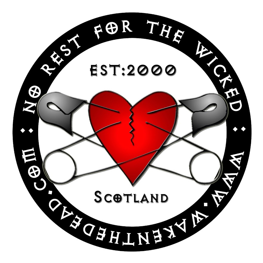
Back in the early 2000s, the internet was rough, band flyers were DIY, and Waken The Dead launched with a look to match. That original logo was a jagged red heart pierced by two silver safety pins, sitting inside a black circle that screamed underground zine culture.
Around it ran the words:
- No Rest for the Wicked
- www.wakenthedead.com
- Scotland
- Est. 2000
It had that early digital charm. Bold, raw, a bit chaotic. But it meant something. Those pins weren’t just decoration. They were set in a cross shape, a subtle nod to the Scottish flag. More importantly, they pointed to Jesus.
The idea was simple. The world is broken. Hearts are hurting. But there is hope in Christ. In the logo, the symbol of punk is holding the heart together. In the real world, Christ is the healer.
Why a Broken Heart?
Because that’s who we’re speaking to. The ones who’ve been through it. The ones who feel torn apart, left behind, or worn down. The broken-hearted.
That’s always been the heartbeat of Waken The Dead, reaching people through the noise and the mess with something real. Not shallow slogans. Just raw, honest faith and great music.
Safety pins have long been part of punk imagery. They represent the makeshift, the patched-up, the held-together-by-a-thread. That’s the gospel in punk language. We’re not polished or perfect, but we are being held together by grace.
The pins in the heart are about mending, not just holding. They point to something deeper. Something lasting.
The Redesign
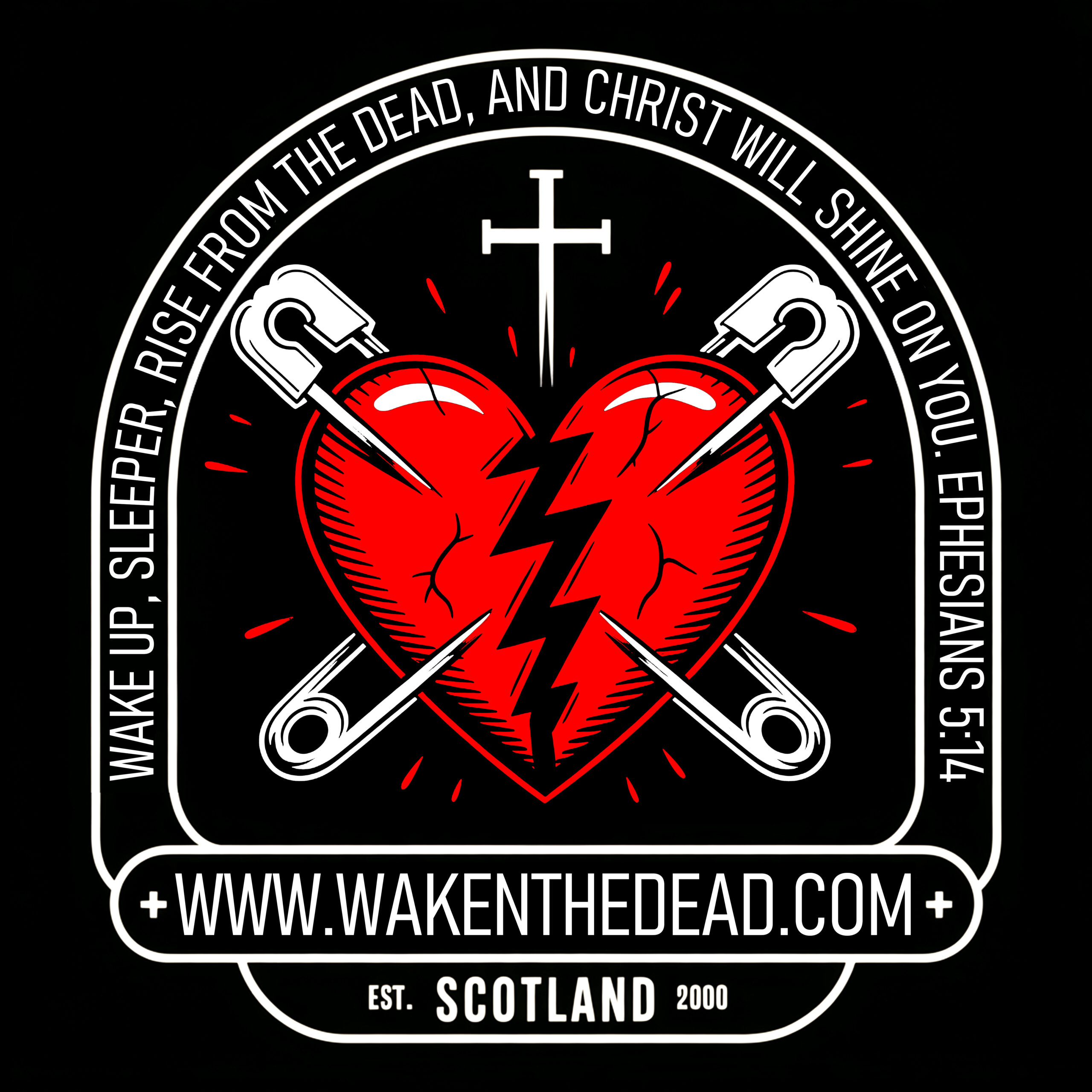
Fast forward to today and the heart still beats, but it’s bolder, sharper, and louder. In the updated design, the broken heart remains, but it’s cracked and scarred with more detail and presence. The pins are cleaner and starker, white against deep red.
The new badge-style version takes it further. Scripture is front and centre, wrapping around the design like a banner on a battlefield.
“Wake up, sleeper, rise from the dead, and Christ will shine on you.”
Ephesians 5:14
That verse isn’t background noise. It’s the call. The mission. The name. At the bottom, the site URL and “Scotland, Est. 2000” grounds it in its roots. And sitting above the heart is a plain white cross. No frills. No fluff. Just truth.
What It All Means
The logo tells a story. A broken heart, wounded and worn. Crossed safety pins, holding it together. Christ at the centre. Punk as the voice. Hope as the message.
Waken The Dead was never about blending in. It’s about standing out for the right reasons. It’s about reaching into the places most churches won’t go. It’s about saying you’re not too far gone. You’re not too messed up. There is a God who still sees you, still loves you, and still saves.
That’s the symbol. That’s the heart of it.
That’s Waken The Dead.